More tabulation options available
It is now possible to display only the highest or lowest values in a table, in ascending order. You decide for yourself how many you want to display. This makes it easy to create top 10 lists of municipalities, professions, educations etc. Statistics and analysis results can also be exported to text files in addition to spreadsheets.
Sorting of values and top 10 lists
Tables created using the tabulate command can be sorted in ascending order by the values in a given column. By default, the column with total values is used if no column is specified. You now also have the option to only display the top or bottom values instead of the entire table. This is an advantage when you have large tables, e.g. displaying municipal values where you have 300-400 rows. You can choose how many you want to display, and for example, create so-called top 10 lists of the units with the highest or lowest values. This is done through the options rowsort and either top() or bottom() as follows:


This can also be done with volume tables, so that you can find, for example, the top 10 municipalities in Vestland ranked by average annual salary:

You can read more about the syntax for rowsort, top(), and bottom() by using the command help tabulate in the analysis environment at microdata.no.
More export options
Previously, it has only been possible to export results to spreadsheets in Excel, Google Sheets, etc. Now you can also export to text format, i.e. you can paste the results into text documents. This makes it easier, for example, if you are just going to present the figures in html format or in a document, without any major processing first.
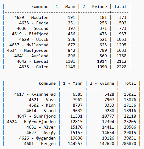
Example of displaying results after exporting to a text file:
Improved readability for tables
Tables in microdata.no display frequency numbers in each cell by default. But you can display more numbers if you use options for displaying both frequency and percentage, or with volume tables where you use summarize() as an option to tabulate, in combination with multiple measurement values, e.g. average and frequency. The illustrations below are examples of the latter.
Before:


Now:


