Graphical display of coefficient estimates is now possible
It is now possible to create graphical displays of coefficient estimates through the use of the new coefplot command.
Running the various regression commands (regress, logit, probit, mlogit etc.) by default generates a table with model and coefficient estimates. With many variables or factor terms in a regression model, it can be demanding to go through lists of coefficient estimates. We therefore introduce a solution where you can display the coefficient estimates graphically through a standard coefficient plot, the coefplot command.
The new coefplot command takes full regression models as arguments, including options. The graphical display will therefore reflect the various options that have been chosen for a regression model. E.g. if you use the level() option to adjust the significance level (default is 5%), you will see that the confidence intervals will adjust accordingly.
Examples of command syntax:
coefplot regress salary age male wealth, standardizecoefplot regress salary i.age male high_edu high_wealth if inrange(age, 20, 40)coefplot ivregress salary male (wealth = age)coefplot logit high_salary i.age male high_wealthcoefplot mlogit wage_cat age male high_wealth, level(99)
Coefficient plots show the estimated coefficient values with associated confidence intervals, which result from running the specific regression model. Values/confidence intervals are colored based on whether the estimate is significant or not, so that this becomes easier to see.
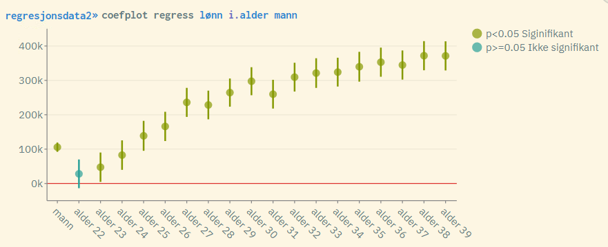

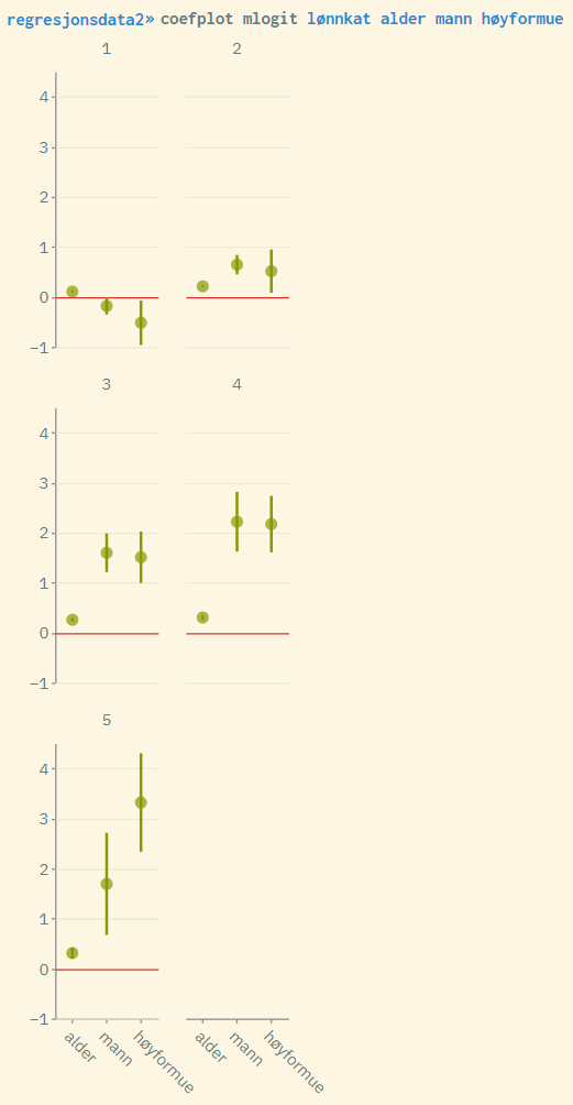
Since coefplot only reports the coefficient estimates and associated confidence intervals, it is recommended to run the regression command in combination with coefficient plot. Then you get all the numbers you need. For example:
regress salary i.age male high_edu oslo
coefplot regress salary i.age male high_edu oslo
